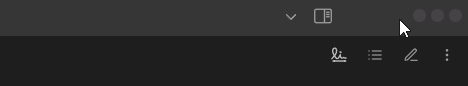
Customize Your Vault Like a Pro - Min, Max, Close Button Like Mac OS
Love the sleek, polished look of MacOS-style exit buttons? The Zen Minimal Exit Menu mod for Zen Browser introduces a refined, circular button layout for closing, minimizing, and maximizing windows—offering both functionality and aesthetic appeal. But why stop at the browser?
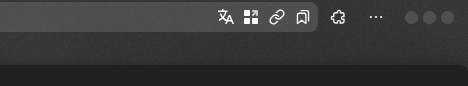
In this instalment of Customize Your Vault Like a Pro, I’ll show how to port the Zen Minimal Exit Menu into Obsidian, giving your vault a more modern, streamlined window control design.
Here’s the full CSS:
  .titlebar-buttonbox {
    margin-right: 20px;
  }

  .titlebar-button {
    padding: 0px !important;
    min-height: 13px !important;
    min-width: 13px !important;
    align-self: center;
    margin-left: 5px !important;
    border-radius: 50px;
    transition: all 100ms;
  }

  .mod-minimize {
    background-color: hsl(280, 2%, 27%) !important;
  }

  .mod-maximize,
  .mod-restore {
    background-color: hsl(280, 2%, 27%) !important;
  }

  .mod-close {
    background-color: hsl(280, 2%, 27%) !important;
  }

  .titlebar-button > image {
    visibility: collapse !important;
  }

  .titlebar-button > svg {
    visibility: collapse !important;
  }

  .titlebar-button-container.mod-right {
    margin-right: 10px;
}
  .mod-minimize:hover {
    background-color: hsl(130, 50%, 40%) !important;
  }

  .mod-maximize:hover,
  .mod-restore:hover {
    background-color: hsl(60, 50%, 50%) !important;
  }

  .mod-close:hover {
    background-color: hsl(0, 50%, 50%) !important;
  }

  .titlebar-button:hover {
     min-height: 20px !important;
}
As a bonus, I’ll also be including a bouncing/gelatin effect:
  .titlebar-button:hover {
    min-height: 20px !important;
	animation: gelatine 1s ease infinite;
}

@keyframes gelatine {
  from, to { transform: scale(1, 1); }
  25% { transform: scale(0.9, 1.1); }
  50% { transform: scale(1.1, 0.9); }
  75% { transform: scale(0.95, 1.05); }
}
The original code for this CSS modification comes from the Zen Minimal Exit Menu mod, created by @Dinno-DEV. Huge credit to him for the inspiration and original implementation! 🎨👏
Read other posts