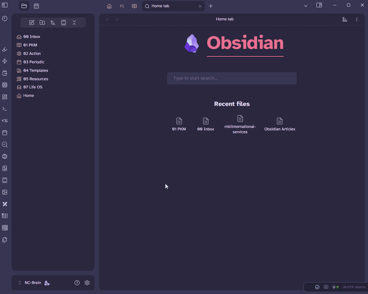
Customize Your Vault Like a Pro - File Explorer and Modal Windows
Next in Customize Your Vault Like a Pro, I’ll guide you through adding a sleek hover effect to file explorer and command palette items, plus showcasing some effects for modal windows like the command palette and settings.
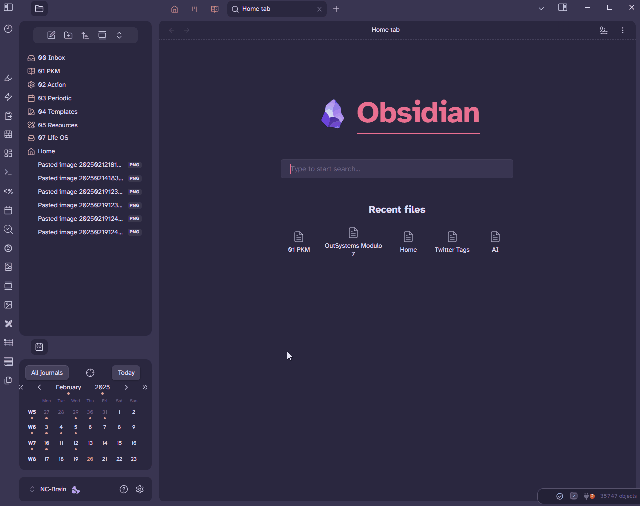
Let’s start by adding a smooth animation to the padding property of the File Explorer.
.nav-file:hover, div.tree-item.nav-folder.iconic-item.is-collapsed:hover {
    padding: 0px 0px 0px 6px;
    transition: padding 70ms ease-in-out;
  }
When you hover over a file (.nav-file) or a collapsed folder (.tree-item.nav-folder.iconic-item.is-collapsed) in the navigation pane, the item shifts 6 pixels to the right by adding left padding. The shift happens smoothly over 70 milliseconds, thanks to the transition property, creating a subtle sliding effect. When you stop hovering, the padding returns to its original state, also with a smooth 70ms transition.
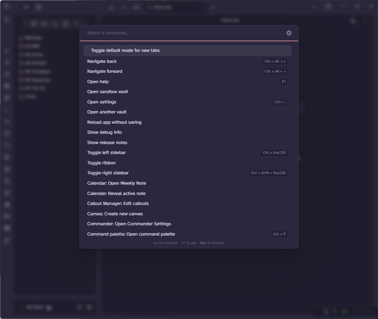
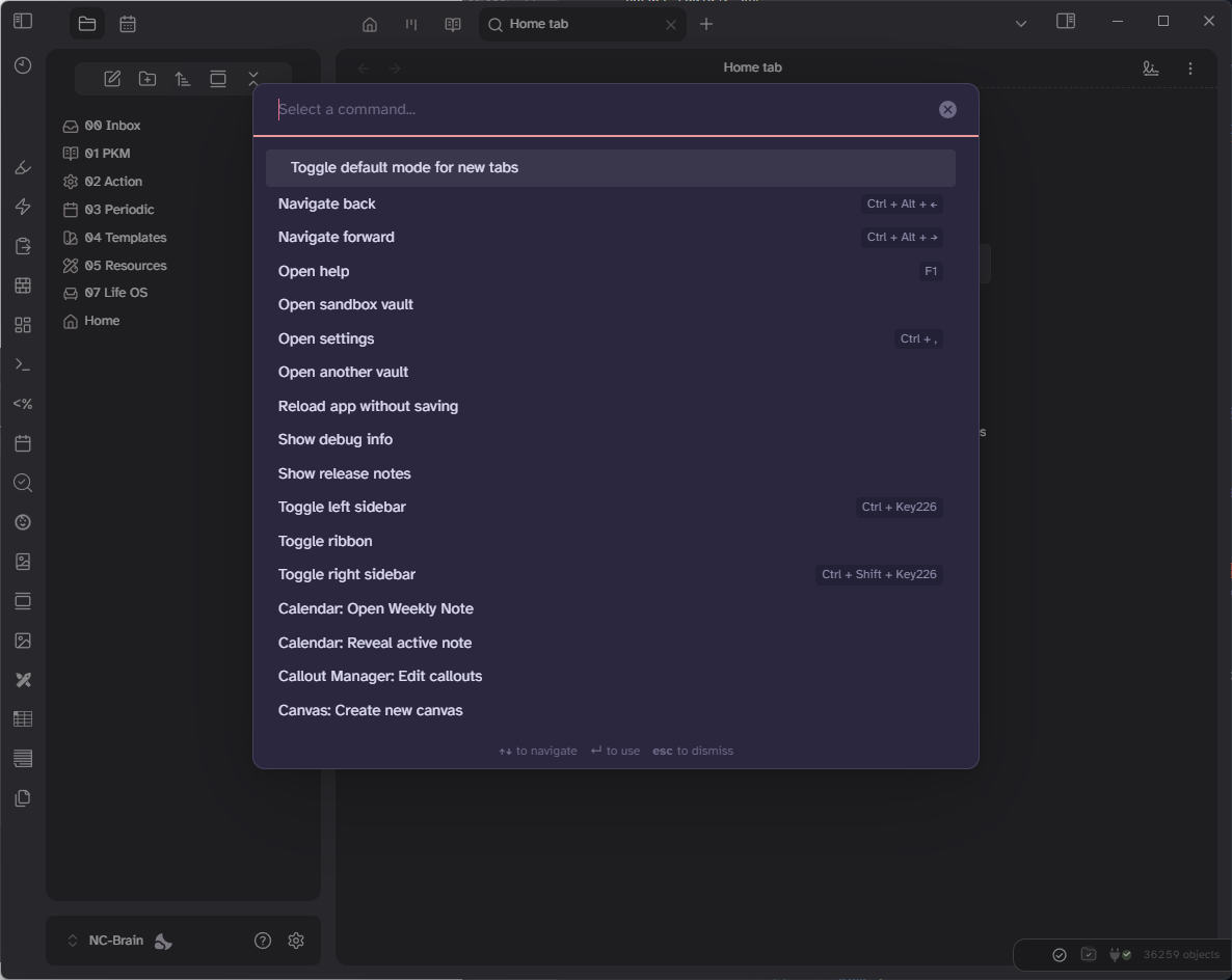
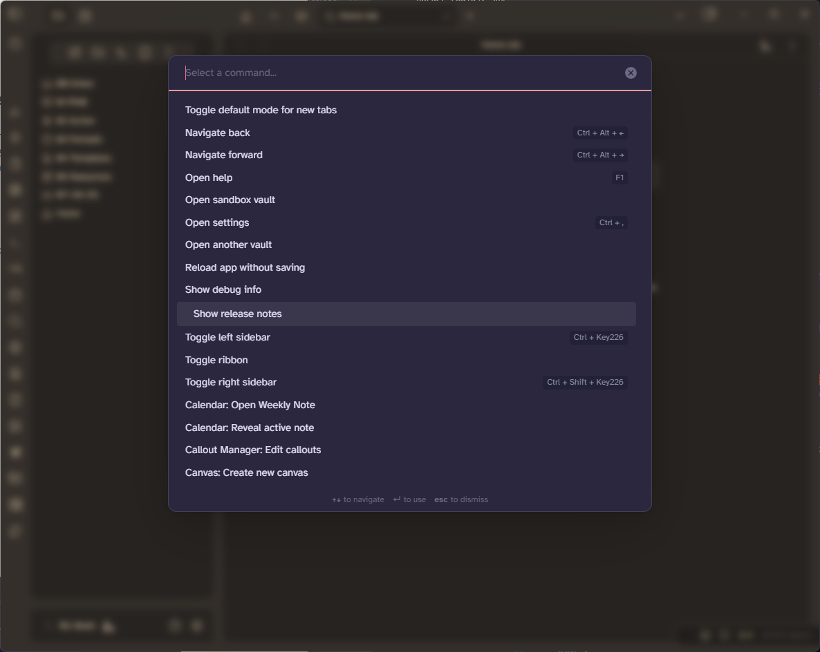
To achieve the same effect in the Command Palette, apply the following code:
.prompt .suggestion-item.is-selected {
    padding: 8px 12px 8px 24px;
    transition: padding 70ms ease-in-out;
}
and in the settings window:
.vertical-tab-nav-item:hover {
  padding-left: 14px;
  transition: padding 70ms ease-in-out;
}
Modal Window Backdrop-Filter Effects⌗
The backdrop-filter CSS property applies graphical effects—such as blurring or color shifts—to the area behind an element. This is useful for creating frosted glass effects, dimmed backgrounds, or other visual enhancements, especially when working with modals, overlays, or translucent UI elements.
Common Effects:⌗
blur(px): Blurs the background by the specified number of pixels.brightness(%): Adjusts background brightness.contrast(%): Modifies background contrast.grayscale(%): Converts the background to grayscale.sepia(%): Applies a sepia tone.opacity(%): Adjusts background transparency.saturate(%): Increases or decreases saturation.hue-rotate(deg): Changes background color hue.
Examples⌗
Blur⌗
.modal-container {
  backdrop-filter: blur(5px);
}
This applies a Gaussian blur to the backdrop. The 5px specifies the radius of the blur: the larger the value, the more blurred the background will appear. This creates a “frosted glass” effect, helping to focus attention on the modal itself while still allowing users to see the blurred content in the background.
Grayscale⌗
.modal-container {
  backdrop-filter: grayscale(80%);
}
This converts the backdrop to grayscale (black and white). The 80% specifies the intensity of the effect:
0%means no grayscale (full color).100%means fully grayscale (no color).80%means the backdrop will be mostly grayscale, with a slight hint of color remaining.
The background content behind the modal window will appear desaturated, with most of the color removed. This can create a dramatic visual effect, drawing attention to the modal while muting the background.
Combine Filters⌗
You can use more than one backdrop-filter effect.
.modal-container {
  backdrop-filter: blur(5px) sepia(80%);
}
As we’ve seen , the blur filter function applies a Gaussian blur to the backdrop, and the sepia applies a sepia tone to the backdrop, giving it a warm, brownish tint. The 80% specifies the intensity of the effect:
0%means no sepia effect (normal colors).100%means fully sepia (a strong brown tone).80%means the backdrop will have a strong sepia tone, but some original colors may still be slightly visible.
This will make the background content behind the modal window appear blurred and sepia-toned. This creates a vintage or “old photo” effect, which can help focus attention on the modal while giving the background a unique stylistic appearance.
Modal Window Appearance Effects⌗
There are many possibilities for modal windows to appear. Here are some ways of showing them using CSS transitions and animations.
Fade In⌗
.prompt, .modal, .vertical-tabs-container {
  animation: fadeIn 2s ease both;
  &::backdrop {
    animation: fadeIn 2s ease both;
  }
}
This applies an animation named fadeIn to the selected elements, that lasts for 2 seconds (2s).
The timing function is ease, which means the animation starts slowly, speeds up, and then slows down at the end. The both keyword means the animation will apply both the forwards and backwards fill modes.

Scale⌗
.prompt, .modal, .vertical-tabs-container {
   animation:scale .55s ease;
}

@keyframes scale {
 0% {
  transform: scale(0);
 }

 100% {
  transform: scale(1);
 }
}
This CSS code defines a scaling animation for modal windows.
animation: scale .55s ease;: applies an animation namedscaleto the selected elements, that lasts for 0.55 seconds (.55s). The timing function isease, which means the animation starts slowly, speeds up, and then slows down at the end.@keyframes scale: this defines thescaleanimation, which scales the element from0(fully collapsed) to1(normal size).
Slide from Bottom with Fade In⌗
.prompt, .modal, .vertical-tabs-container {
  backdrop-filter: blur(5px) !important;
  animation: fadeIn 1s, slideIn .8s linear;
}

@keyframes slideIn {
  0% {
    transform: translateY(400px);
    animation-timing-function: ease-out;
  }
  60% {
    transform: translateY(-30px);
    animation-timing-function: ease-in;
  }
  80% {
    transform: translateY(10px);
    animation-timing-function: ease-out;
  }
  100% {
    transform: translateY(0px);
    animation-timing-function: ease-in;
  }
}

@keyframes fadeIn {
  0% {
    opacity: 0;
  }
  100% {
    opacity: 1;
  }
}
This combines a backdrop blur effect with two animations: fadeIn and slideIn.
backdrop-filter: blur(5px) !important;: applies a blur effect to the backdrop behind the element (e.g., the background content).animation: fadeIn 1s, slideIn .8s linear;: applies two animations simultaneously to the element:fadeIn: lasts 1 second and gradually changes the element’s opacity from0(transparent) to1(fully visible).slideIn: lasts 0.8 seconds and uses a linear timing function (constant speed) to move the element vertically into view, with some bouncing effects.
@keyframes slideIn: this defines theslideInanimation, which moves the element vertically with a bounce effect. Theease-inandease-outtiming functions are used to slow down at the end of the segment and speed up at the start of the segment, respectively. This creates a natural “bounce” effect.
In this article, I’ve walk you through adding sleek hover effects to file explorer and command palette items, enhancing interactivity and visual appeal. Additionally, I’ve dove into creating stunning effects for modal windows, such as the command palette and settings, to make your vault not only functional but also visually polished. Stay tuned for more articles on how to transform your workspace into a professional, customized environment!